This is a passion project to redesign Fannie Mae's current logo identity. My curiosity led me to research their branding after receiving one of their envelopes upon the purchase of my first home.
While is it common for real estate industry logos to incorporate the identifiable shape of a home, I felt that the name "Fannie Mae" was unique on its own. This meant eliminating the symbol and introducing an appropriate type face that would emphasize the company's name in a creative way.
While is it common for real estate industry logos to incorporate the identifiable shape of a home, I felt that the name "Fannie Mae" was unique on its own. This meant eliminating the symbol and introducing an appropriate type face that would emphasize the company's name in a creative way.
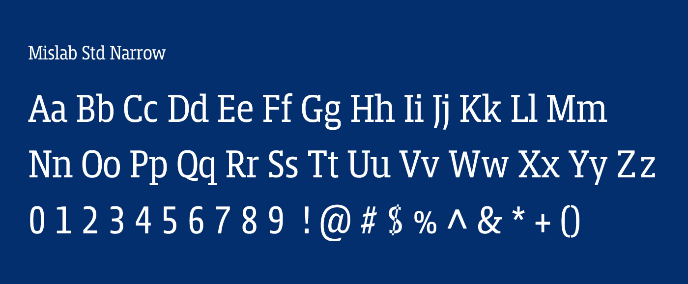
The type face used for the logo is Mislab STD Narrow. The decision to use this font allows for a bold yet soft appearance that is stable to adapt to a variety of digital and print platforms—while maintaining a high level of clarity.